STUPID-19 strikes again: Georgia Gov. Brian Kemp releases rigged coronavirus chart that scrambles dates to create false impression of infection decline
05/19/2020 / By Mike Adams

STUPID-19 is a disease that makes people lose their minds when they try to deny the existence of the coronavirus pandemic. Today, STUPID-19 has struck the Governor of Georgia.
In what must be the most outrageous example of data fakery and government fraud we’ve seen yet, the Republican Governor of Georgia, Brian Kemp, has been caught red-handed releasing a misleading coronavirus infection trend chart that “scrambled” dates to create the false impression of a steady decline in coronavirus infections.
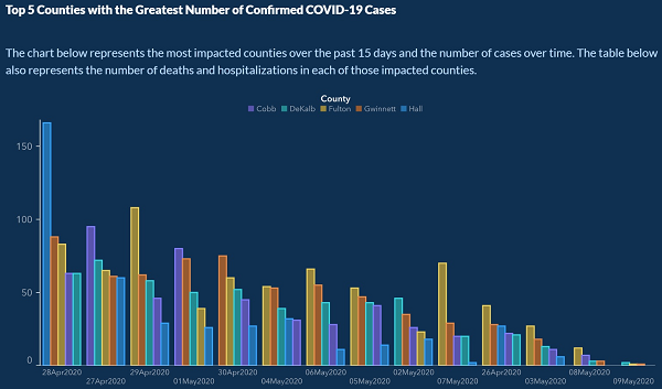
The graph, shown below, was released by the Georgia Department of Health and covers Cobb, DeKalb, Fulton, Gwinnet and Hall counties, appearing to show a steadily declining infection trend for all five counties over time.
But it turns out the x-axis of the chart used “scrambled” dates that were obviously hand-picked to create the false appearance of a downward trend over time. Normally, a chart that presents an x-axis of time would use sequential segments of time, not scrambled days or months that are picked solely to produce an apparent visual trend. But if you look closely at the x-axis below, you’ll see the chart begins with April 28th, then goes to April 27th, April 29th, May 1st, April 30th, May 6th, May 4th, etc.
In other words, Georgia scrambled the x-axis, choosing data from dates that would create a visual downward trend, even as the state claimed the chart showed data “over the last 15 days.” Technically it did, but not 15 sequential days.
Chronology be damned. Georgia wants to “prove” the coronavirus is no big deal, and they’re willing to travel back and forth through time, if necessary, to reinforce that point.
Here’s the big picture of the chart, which claims to present data “over the past 15 days and the number of cases over time.” (I guess technically they didn’t promise the “time” would be sequential…)
And here’s a zoomed-in version showing you some of the dates along the x-axis:
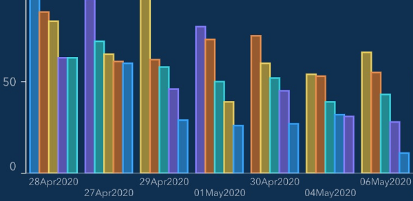
Notice how the dates are all scrambled, sort of like Brian Kemp’s STUPID-19 brain.
We give Kemp one thumbs up for effort, but another thumb up his ass for stupidity. Only in a Republican-led denialism state where numbers, math and charts are apparently befuddling to the guy in charge would we end up with this hilariously lame attempt at public deception.
Oh, and the Governor’s communications director, Candice Broce (@Candicebroce) must have undergone a frontal lobotomy before posting this indecipherable explanation on Twitter that tries to justify the obvious fraud. See if you can make any sense of this:
“The x axis was set up that way to show descending values to more easily demonstrate peak values and counties on those dates. Our mission failed. We apologize. It is fixed.”
This graphic has been the subject of much head scratching by the @AJCInteractives team today. https://t.co/FS69vasFxR
— Pete Corson (@petecorson) May 10, 2020
Wait, whah? “To more easily demonstrate peak values and counties on those dates?”
Oh dear God, please tell me these aren’t the people in charge of the great State of Georgia.
I mean, with numbers and dates and colored bars and math and sh#t, sure it can all get confusing when you’re suffering from STUPID-19, but as my way of offering public assistance to the brain-dead leaders of Georgia, might I suggest counting on your fingers and toes, which will at least get you to 20 unless you’ve had a horrible barefoot mowing accident of some kind.
And if you can count to 20 without getting confused, heck, you should run for Governor and try to displace the current governor who can’t seem to count to 15 (days).
Kinda makes you wonder how these people are supposed to lead an “economy recovery,” doesn’t it? Maybe the economy of Georgia will achieve a sharp upward trend but only if you rearrange the dates in just the right way…
See more stories about real-life science clowns at ScienceClowns.com.
Tagged Under: Brian Kemp, chart, coronavirus, covid-19, denialism, Georgia, government, incompetent, insane, lunatics, President Trump, stupid, Stupid-19